
Overview:
Create a logo for a new non-profit organization whose mission is to help children and adults with special needs. The Paul Van Handel Memorial Foundation provides grants to individuals and care-givers of those with special needs to help with the cost of daycare, respite, or medical equipment.
Target Audience:
There are two separate audiences to consider: those who are applying for the grants, as well as people who have the means and desire to donate.

Key Design Criteria:
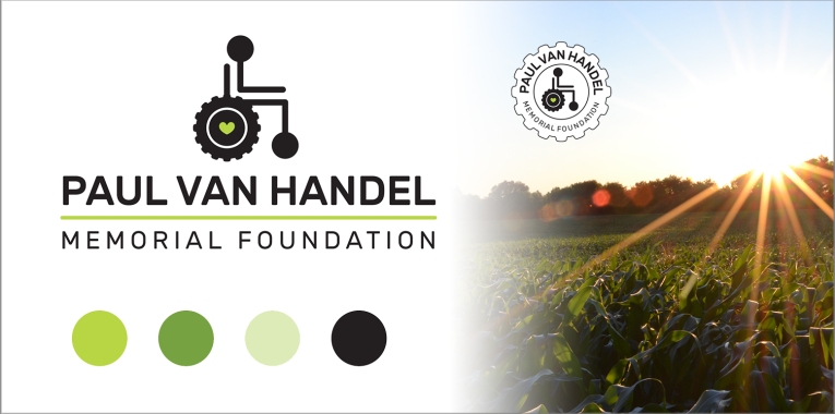
The Paul Van Handel Memorial Foundation seeks to be the avenue for philanthropists to help children and adults with disabilities. The foundation used keywords such as “caring, empathetic, sympathetic, helpful, and kind” when describing their brand.
The seed money for the foundation came from an individual who was a life-long
farmer. It was important to the client that the logo mark incorporate elements of
farm life while being easily recognizable as an organization serving those with
special needs. I explored a variety of graphic elements representing both farming and those with special needs and landed on a tractor and a wheelchair.
Typography + Colors:
I wanted to use a font that mimicked the clean, smooth lines of the graphic. I desired a font that didn’t have sharp, hard edges, but also one that was simple and readable. By using two weights of the font, the somewhat long name of the organization is broken down into two smaller, easier-to-digest pieces and the capital letters really help give the logo a solid, sturdy base.

In thinking about which colors might best represent this organization, I decided that the rich, vibrant greens of bountiful crops and plant life would mirror the nurturing, and life-enriching services of the foundation.
Primary Logo:
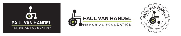
Secondary Marks:
This project was created with iDesign’s Non-Profit Branding Package. Contact me for details about how your non-profit organization could benefit!
