

Overview:
Create overall branding for Anja Farin, LLC, a female, service-oriented business, focused on holistic health, pregnancy and postpartum well-being; “Supporting a healthy motherhood”. Design logo, secondary marks, and supporting pattern.
Target Audience:
Career women of childbearing age; women who place an importance on individualized, whole-woman, and natural modalities of care.
Key Design Criteria:
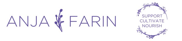
Main colors suggested were gray, green, blue, or purple. I loved the idea of using the calm, soothing hues of blue and violet and chose a few muted shades of those to create a soft, ethereal feel. I visited the Etsy pages shared by the client and noticed the emphasis on type with an overall relatable, simple feel. I wanted to create a design that was strong and capable, yet maintain that gentle and approachable impression. Finally, by using the floral wreath element in the design, it alludes to the herbal, natural aspect of the business.

Typography:
The client and I discussed the potential issues around using her name for her business. She expressed the concern that her name is not such an easily recognizable name, so we felt that it was important that the chosen font didn’t add to any possible ambiguity. We chose a clean, simple font, and then brought in the flowing, script font she loved so much in the tagline below. It is a nice compromise on form and function.
Primary Logo:

Secondary Marks:
Applications:


Thanks for all the help and support Rachelle! It’s always a joy to work with you.
Thank you, Anja! I loved working on this with you! All the best.